


Yum Yums
Brand Identity/
Packaging
Yum Yums
From Hand-Drawn Logo to Custom Shaped Packaging
Yum Yums was a full-scope creative project where I built the brand entirely from scratch. From the earliest stages, I focused on shaping an identity that felt playful, bold, and scroll-stopping — perfect for a TikTok Shop audience. The logo was hand-drawn by me, designed to feel like candy: soft, fun, and instantly recognizable. It evolved through several iterations before landing on the final wordmark, which balances a youthful energy with high-impact visibility.

From pencil sketch to scroll-stopping logo.
The Yum Yums branding began with a completely blank slate — and the first thing I created was the logo. Instead of starting with fonts, I hand-drew the logo myself to give it an organic, candy-like feel that couldn’t be replicated. The design evolved through several stages, balancing bold curves with playful energy, until it captured exactly what the brand stands for: fun, flavor, and a little bit of chaos.


Custom Packaging Design & Dieline Innovation

For Yum Yums, the packaging had to be just as fun and bold as the product itself — something that would stand out both in-hand and on a TikTok scroll. Instead of settling for a standard mylar pouch shape, I created a custom dieline from scratch — a completely unique silhouette designed to feel more collectible, more playful, and unmistakably “Yum Yums.”
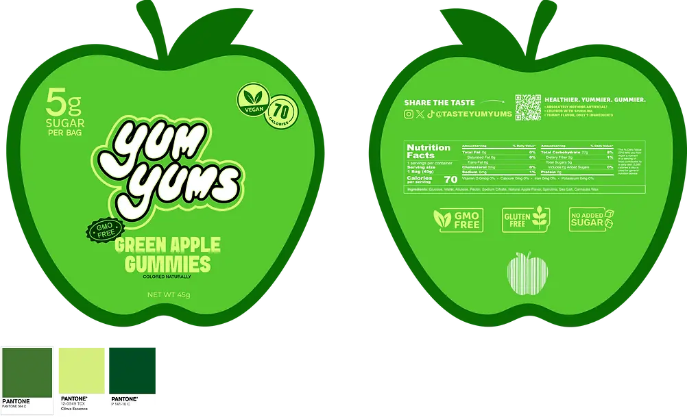
From the placement of design elements to how the pouch curves and holds its form, every detail was crafted with personality and shelf appeal in mind. The colors, layout, and proportions were all strategically built for TikTok Shop performance, with visuals optimized for social media thumbnails, video content, and mobile-friendly product pages.


